Clarity Design System
CLARITY DESIGN SYSTEM
Crafting our design true north
The Challenge
How might we create a living design system which will continuously evolve with our brand, changing technologies and user trends?
I participated in a core execution team to envision, build and continuously maintain our living design system.
My Role:
Product Designer in the core design system team, supported by our Lead UX Engineer, Design Manager, and Visual Designer.
My Goal:
Create a consistent visual and interaction experience across all digital touch-points through design patterns and components based on best practices.
Deliverables:
- High Fidelity mockups and notes for UX Engineer
The Process
Our Design Process
Overview
The Clarity Design System is R+F UX's design true north- the one resource for all our UI Patterns, components, and our design philosophy.
It was important for our team to build a design system to standardize the look and feel of several disparate sites across our ecosystem, many of which were built by different vendors.
- Team effort, continuously evolving
- Weekly meetings for design critique and alignment
- Living product with owners, roadmap, dedicated resources
- Designed with accessibility in mind
- Hosted independently by UX Engineer
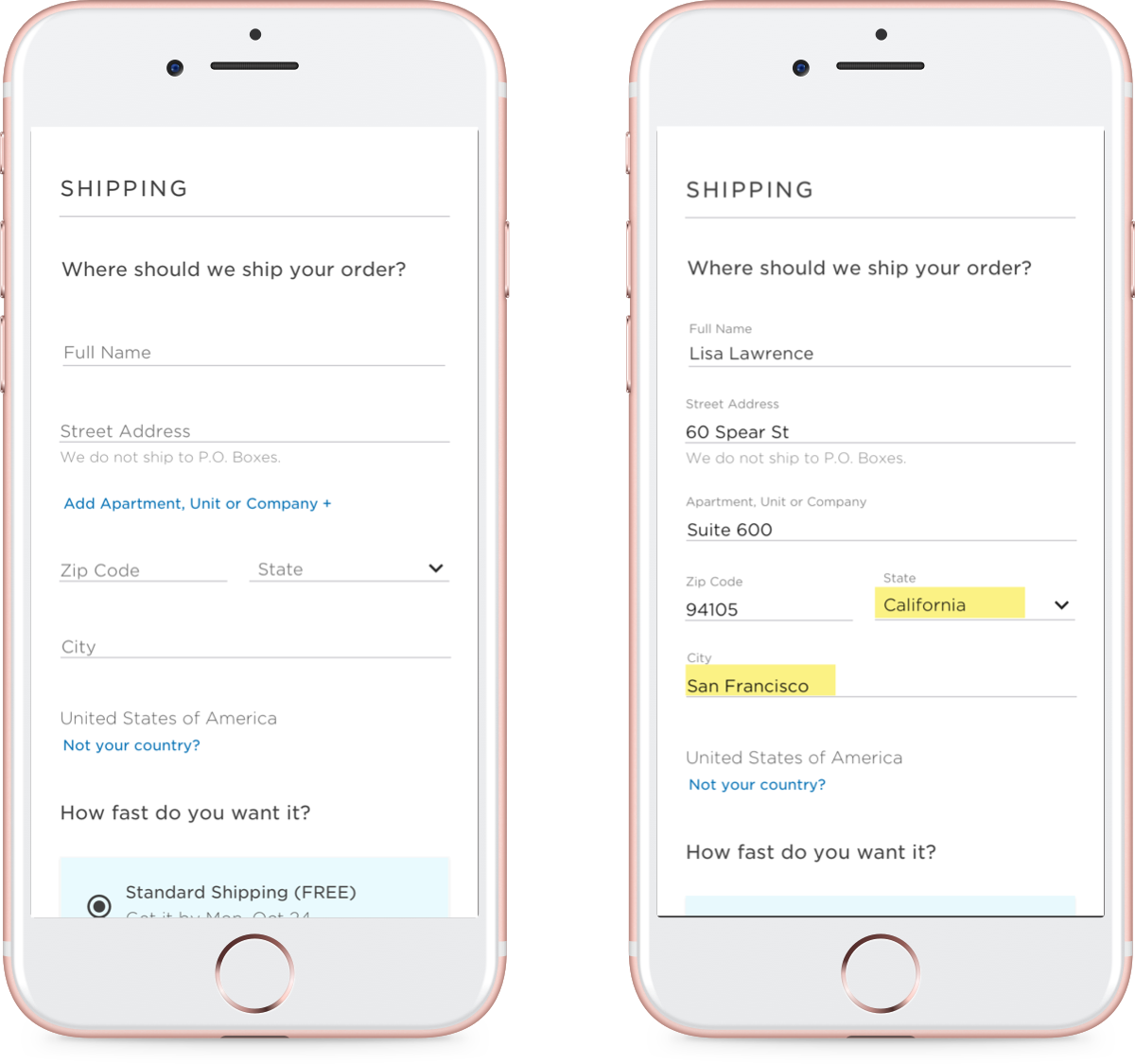
- Personally responsible for form fields, shopping cart pages, progress indicators and more. Drew inspiration from competitors, online pattern libraries, Pinterest, and testing findings on existing design projects
My Component Designs
Using Clarity in Designs
I used Clarity heavily as a reference point when designing new experiences. Rules and patterns outlined in Clarity informed both interaction and visual design, and handoffs to developers were simpler and more streamlined. Below are some examples of projects leveraging Clarity:
A Learning and Development CMS for Rodan + Fields Australia
E-Commerce Checkout Redesign
Autoship Cart


