WeTravel Yoga
WETRAVEL YOGA PAGES
Creating a Landing Page and Filter / Sort Trip Listings
The Challenge
How might we create a compelling, understandable landing page and trip listing page targeted specifically towards yoga retreat bookers?
After finding a method to get Yoga retreat organizers to list their trips on Wetravel at scale, the company identified an opportunity to create an SEO-optimized landing page and trip listings page targeted specifically toward yoga retreat bookers. I created a yoga landing page and trip listings page for them in three weeks.
My Role:
Sole product designer, on contract. I worked directly with the founder and CTO.
Our Goal:
Create visual appealing, SEO-Optimized landing page and trip listings page in three weeks.
Deliverables:
- Landing page and listing page hi-fi clickable prototype and mockups
- Spec export via Sketch Measure
- Final presentation to client.
The Process
The Constraints
Minimal Traffic / Marketable Content: As Wetravel is an early stage startup, the product only features ~20 current public trips, and less than 2000 users. Due to the low number of daily active users, A/B testing was not a feasible option, and the number of trips that could be featured or highlighted were very limited.
Limited Backend Functionality: As the team was resource strapped, they were not able to implement certain functionality on the backend, e.g. location-based tailored content, which I suggested strongly for the landing page.
Results Sneak Peek
DIGGING DEEPER:
User Testing and Interviews
The process began, as always, with user research.
I sourced five yoga lovers through my yoga class and friends, and interviewed them in person or via google hangout. I asked them to describe their last yoga class and yoga retreat in detail, pulling key words and insights. These words would later influence the copy on my page. This also helped me dig a little deeper into people's motivations for doing yoga, and what they valued most.
“Yoga is a way for me to become reacquainted with my body and feel things I’ve never felt before."
I also conducted usability testing on WeTravel Yoga's competitor site, bookyogaretreats.com, in order to pull more specific insights related to yoga retreat booking. I asked testers to find a retreat they would like to book on the competitor site, walk me through their process and think aloud about why they were making certain decisions.
A Google Hangout User Test in Action
From there, I gathered great insights and quotes about why people did yoga and what were the most important factors they considered when booking a yoga retreat.
The Key Factors that Yoga Retreat Bookers Value
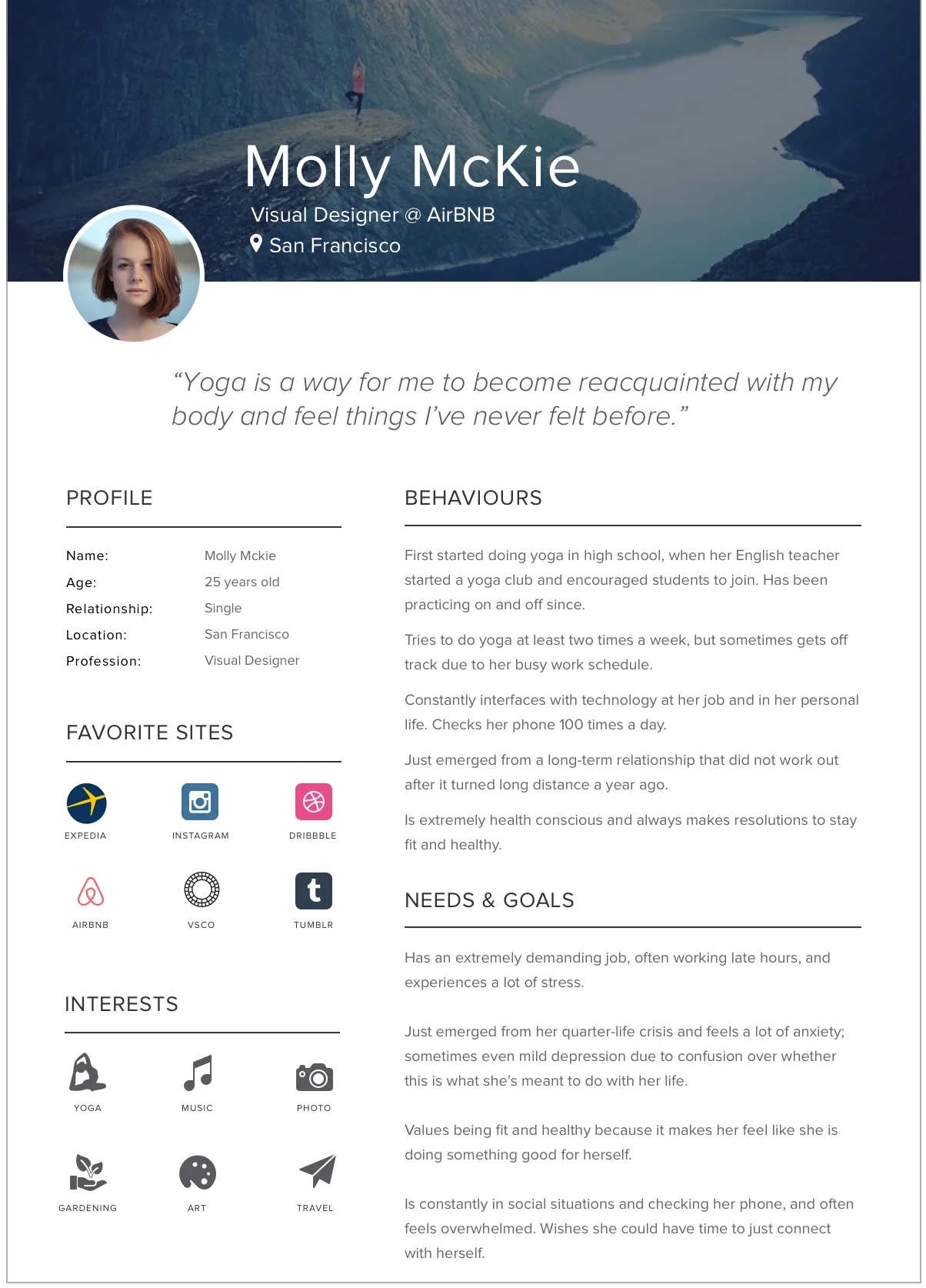
Persona
After gathering and synthesizing main user insights from the research phase, I created a persona of the typical WeTravel Yoga user who I could always refer back to.
Wireframes
After sharing these user insights with the client and getting feedback, I moved into wireframing and brainstorming ideas for the yoga landing page and trip listing page. I also looked at a lot of competitors for inspiration, including Trip Tribe, G Adventures, Intrepid Travel, Air BNB, and other non-direct competitors but similar listing sites like Hotels.com and flight bookers.
There were my first hand-drawn sketches:
Sketches
I then turned these wireframes into higher fidelity ones on Sketch:
I delineated the key sections of the page according to the key factors that users felt were important to them when choosing a retreat- Location, instructors, extra options and yoga styles.
Here, I also saw an opportunity for the client to create tailored location-based content, e.g. showing users "weekend retreats" vs more exotic, long-term getaways. However, the engineering resources at WeTravel were limited, and the feature could not be implemented at this time. I created the wireframes anyway for the client to reference at a later date.
Prototyping and Testing
After a feedback loop, I created hi-fi mockups for the yoga page and trip listings page in Sketch, and then turned them into an interactive prototype using Invision.
I made sure the visual design was consistent with the redesigned WeTravel style guide that my team created for the landing page redesign.
I also wrote all the copy on the landing page, ensuring I was hitting key words that users used to describe their yoga experience during user testing, as well as a list of SEO-optimized keywords that were passed to me by the founder.
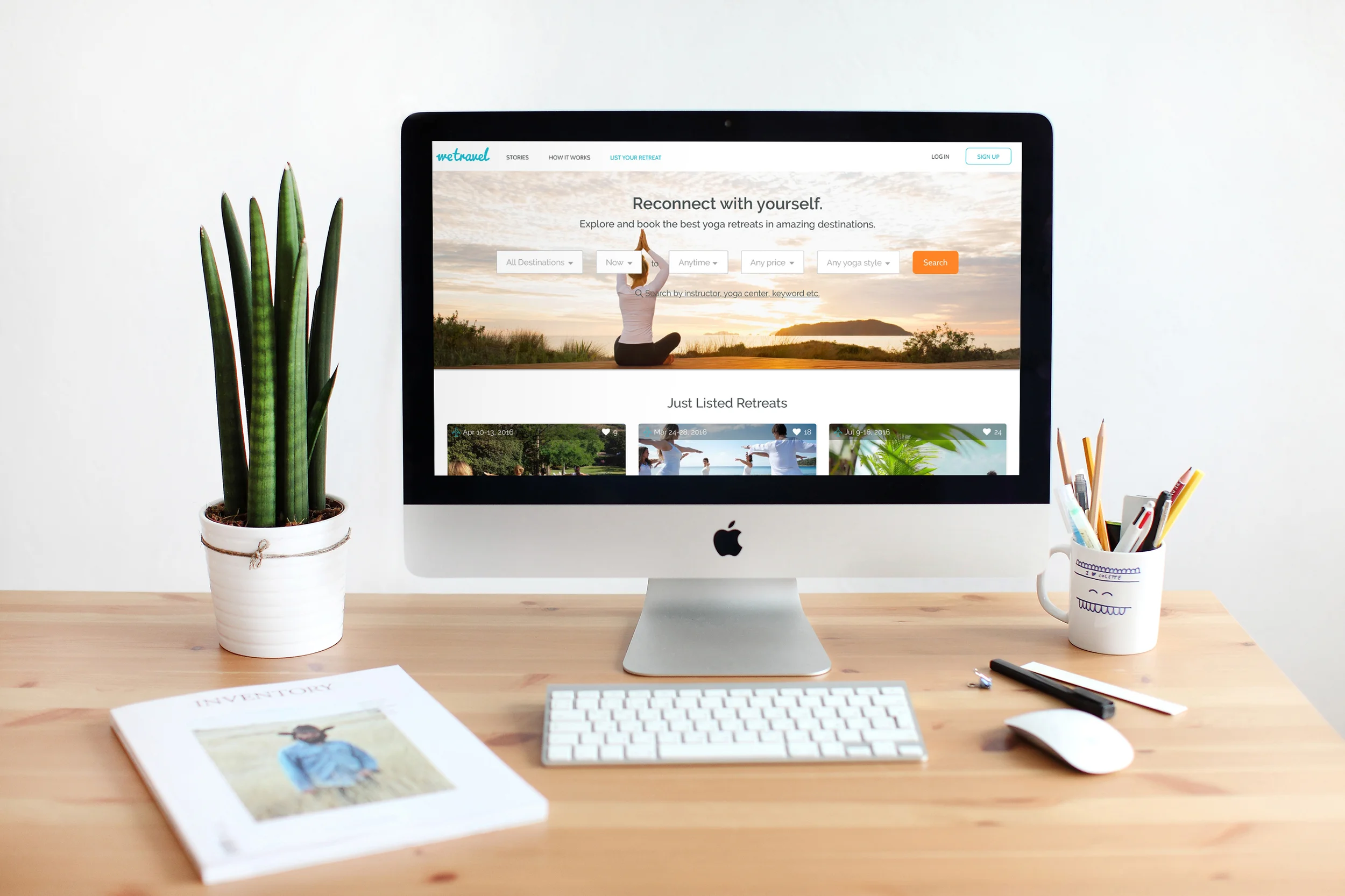
Yoga Landing Page
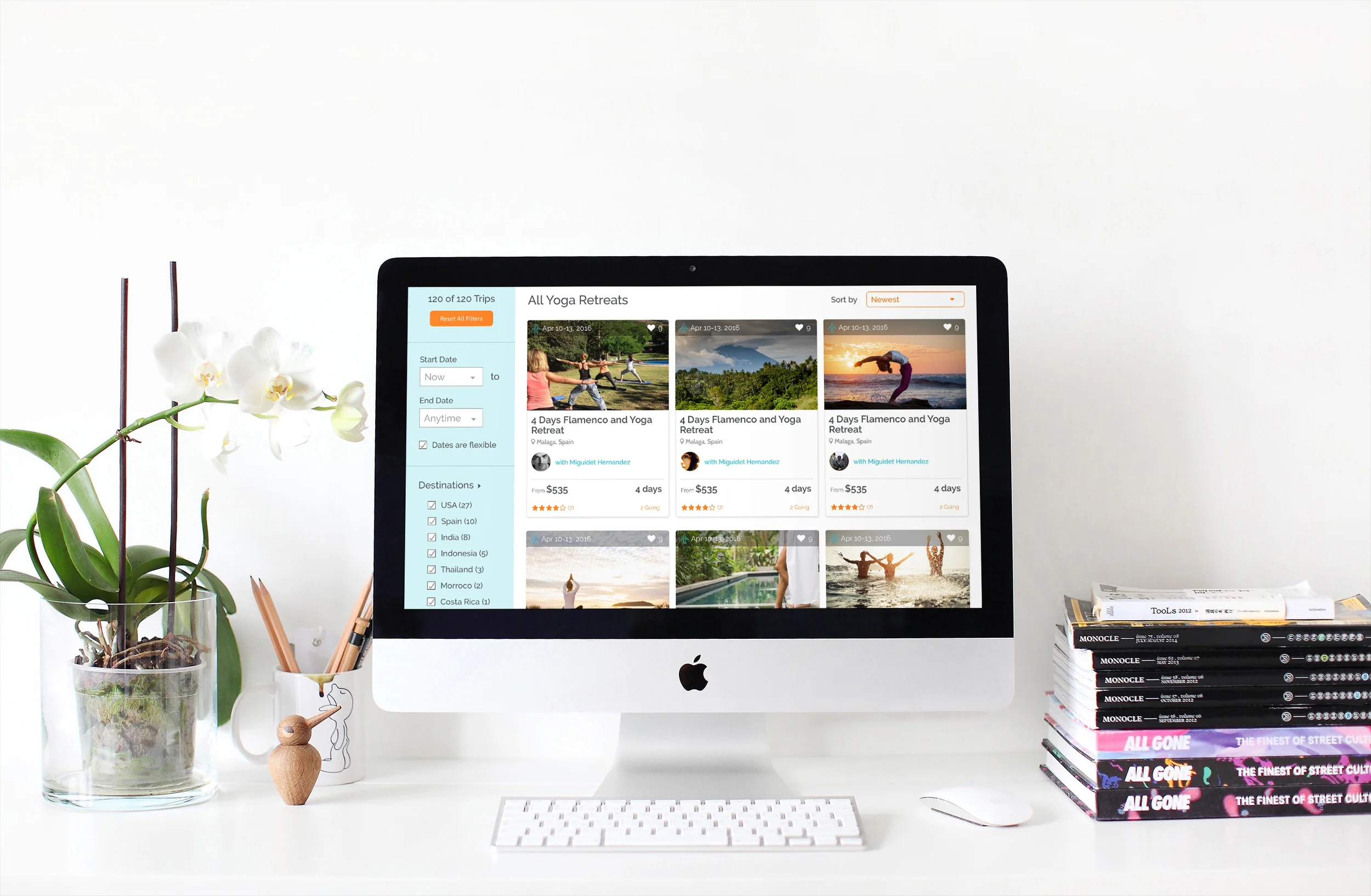
Trip Listing Page with Filter / Sort Functionality
I then took my prototype into a final round of validation testing, in which I sourced five yoga-lovers on craigslist with a survey that i drafted to ensure they were hard-core yogis who had been on yoga retreats.
I tested them using a very similar methodology to my initial user testing, asking them to start their journey from the redesigned Wetravel “Join a Trip” landing page, and then:
- Imagine they have some vacation days coming up and want to book a yoga retreat
- Find a retreat on the site, walk me through the process of finding and selecting that retreat, and think out loud.
I saw lots of successes in the testing. The page performed extremely well and validated my initial user research findings that the factors of location, instructor, extra options, and yoga styles were important to the user.
I also made two final tweaks to the prototype based on additional insights that were uncovered, specifically around more copy transparency and preferred extra options.
The Final Product
I delivered the final assets and specs to the founder and engineer shortly after validation testing, and made small final tweaks onsite according to final client asks. I recommended that they continue A/B testing and conducting user testing to further validate and tweak the page.
But for now, we had a beautiful and intuitive digital yoga experience that the team is currently building, and should be launching in the next few months.


